TRAX Brand Assets
CORRECT LOGO USAGE
It is important that the TRAX logo is placed correctly, consistently and without distortion of any kind. Always print the identity in the approved TRAX colors. Always use the created logo files; never recreate the logo.
BRAND IDENTITY
It is important to maintain the integrity and consistency of the TRAX identity. The identity must always be presented in a clear and legible manner.
The identity must always be reproduced from the approved files.
Alterations to the identity are strictly forbidden.
Additional factors to consider when using the identity include colors, backgrounds and the clear zone.
MINIMUM CLEAR ZONE
Whenever the identity is used, a minimum clear zone must surround it to ensure its visibility and impact. The size of the clear zone (indicated as “x”) is determined by the height of the TRAX logotype, as shown. No graphic elements of any kind should invade the clear zone.
x = width of center stroke of T
MINIMUM SIZE
For the greatest impact and readability, the identity should never be reduced beyond 20px in height in screen applications and 0.25” for print applications.
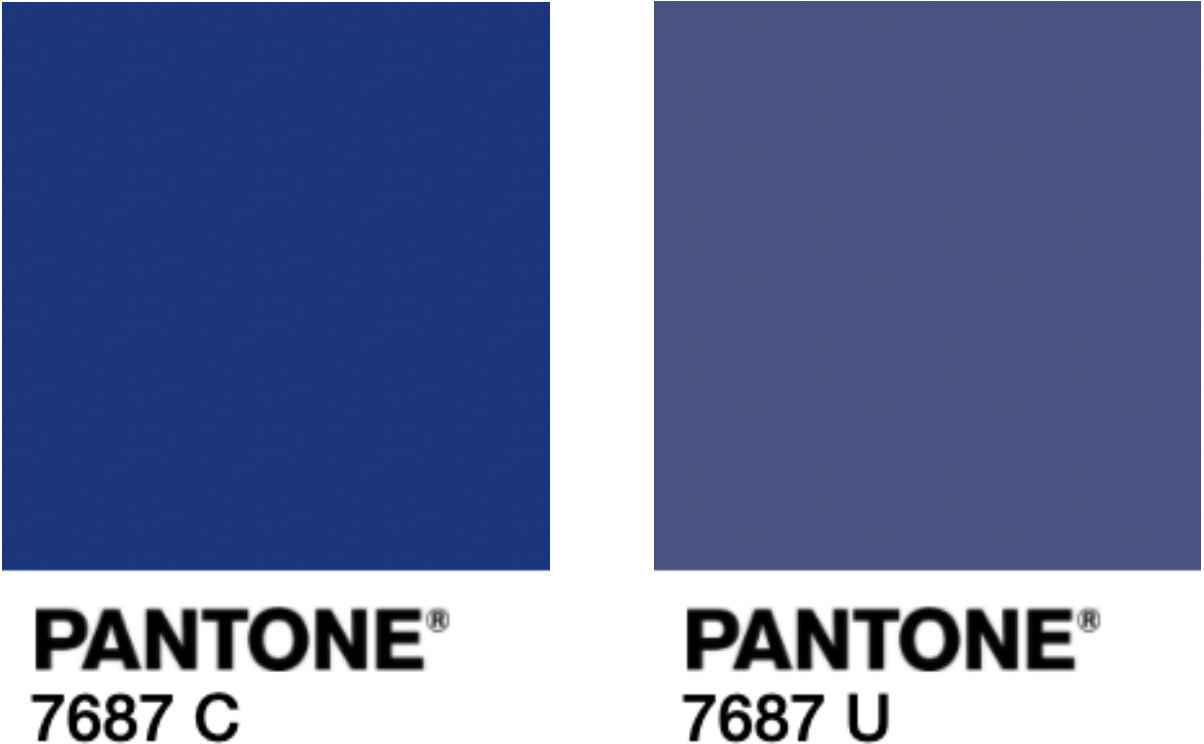
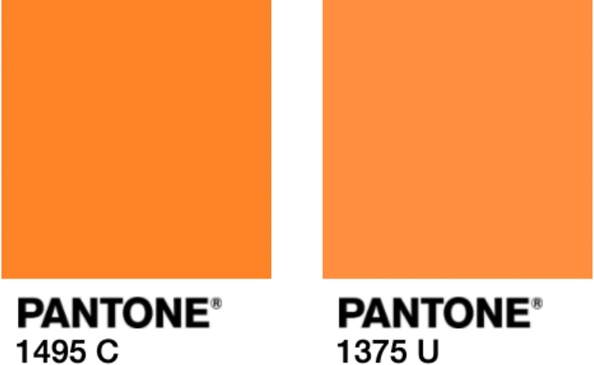
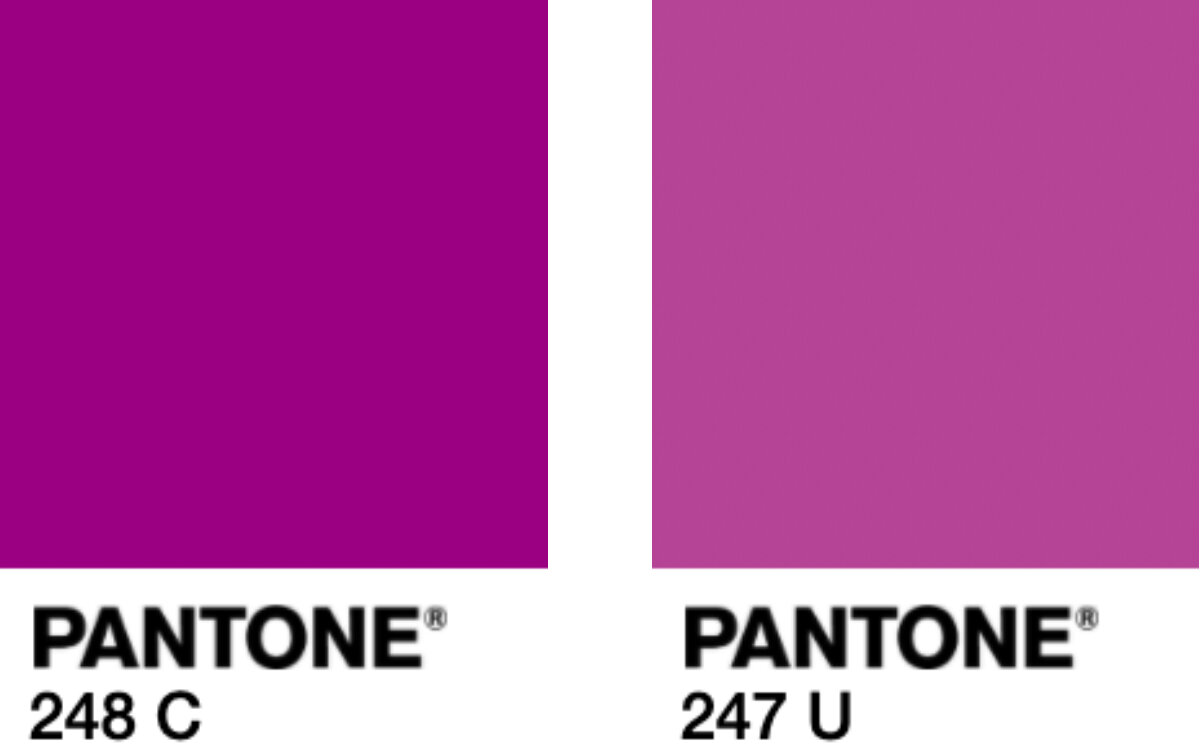
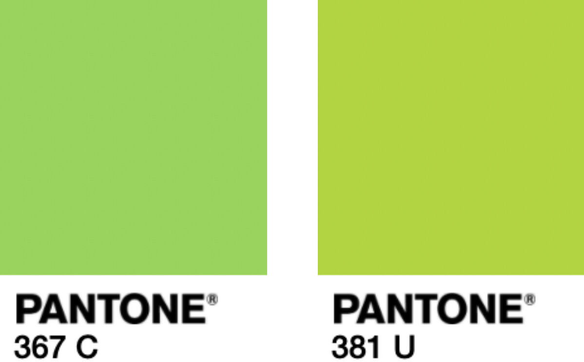
TRAX IMAGE SYSTEM COLOR PALETTE
The identity should be printed in the approved TRAX colors. TRAX colors were carefully chosen to complement the brand personality. Please note that some of the colors may have different numbers for Pantone coated versus uncoated. See the chart for CMYK and RGB breakdowns of these colors. Use RGB values when creating electronic media such as web, digital presentations, video, mobile, etc.
PRINT FONTS
All Round Gothic and ITC Avant Garde Gothic are the font families chosen for the TRAX image system. All collateral materials and web design in the image system should use these font families. This typeface was carefully chosen to match the TRAX brand personality.
View a copy of the full TRAX Brand Identity Guidelines.


